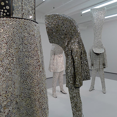
In the beginning of October I went with my friend Claudia Brown to see Nick Cave's work in two galleries in Chelsea...Jack Shainman and Mary Boone. These first photos are from the show titled "Ever-After" at the Shainman Gallery. Unlike his previous vibrantly colored work, here the tones are subtle...mostly white, off white, and silver. The exaggerated silhouettes and forms really stand out because of the quieter palette. This show is about the after life. In "Ever After" the items he uses are simplified to buttons, or hair, not a mixture of hundreds of different materials as you'll see in the Mary Boone show. Claudia is a Costume Designer so it was particularly interesting to see this show through her eyes. She and I worked together on this post.
Above: This grouping is reminiscent of a New Orleans Jazz band, perhaps a funeral procession.
Above: King Oliver's Creole Jazz Band, 1921
Above: A New Orleans Jazz Funeral. After playing soulful sad dirges on the way to the cemetery the tone changes entirely when the hearse is sent off. Then come the energetic songs such as "When the Saints Come Marching In". Mourners dance "with wild abandon...bedecked with umbrella, which they twirl with joy. It's considered good form to dance a stranger into the afterlife. The Dahomean and Yoruba of West Africa thought that death, in this world, meant that a spirit could now run free into a new one. Though their death would be mourned, there was comfort knowing the spirit would be dancing on the other side."
Above and below: The imperfect color here adds an interesting quality...stained like spilled coffee.
Above and below: Pearly Kings and Queens in London. The first Pearly King was Henry Croft, born 1862, an orphan street sweeper who collected money for charity. He decorated his clothing with pearl buttons to draw attention to his cause. In 1911 an organized Pearly Society was founded, which still exists, raising money for London based charities.
Below: A Nick Cave film showing at the Shainman Gallery
Above: We were both transfixed by a wonderful film of some of Cave's "Sound Suits" in action. It's really a phenomenal sight to see the motion of the fibers when the suit's inhabitant jumps and dances...a visual pleasure. Nick Cave is also a dancer, which is incorporated into his work. See more HERE.
Above: A Wookie from Star Wars might have been influential.
Below, you can see images of the work shown at Mary Boone. This show was called "For Now". Unlike the Shainman show, this one's about life in this world. It's a show of wildly colored and embellished "Sound Suits". His suits, both armor for braving the world, and having a sense of joyful celebration, refer to all sorts of ritual costumes and imaginary creatures.
Below, you can see images of the work shown at Mary Boone. This show was called "For Now". Unlike the Shainman show, this one's about life in this world. It's a show of wildly colored and embellished "Sound Suits". His suits, both armor for braving the world, and having a sense of joyful celebration, refer to all sorts of ritual costumes and imaginary creatures.
Above: These bring to mind performance artist Kim Jones. In the 1960s he was seen around L.A. in the guise of "Mudman" wearing mud and sticks, as you can see below.
Cave's first Soundsuit was created in response to the Rodney King trials of 1992. As a black male, Cave wanted to create art reflecting the scary and seductive language used by the media in reference to King. With a background in dance and a degree in art, Cave was interested in merging the two disciplines of textiles and movement. Sitting on a park bench in Chicago, the powerful language of the trial weighed on his mind, and Cave began to gather twigs. He wanted to fashion the twigs into a sculptural object, but as he worked, he realized it could be worn. The twigs rubbed against each other, rustling when he moved, and the first Soundsuit was born. "I wanted to transform trash to treasure, to analyze and redefine the abundance of waste, to force the viewer to think about what we discard and elevate it to a level of beauty. That is the power of art," Cave says.
Cave is quoted in the New York Observer as saying:
I'm totally consumed by the special attire that has a powerful and meaningful purpose within a culture. I'm looking at rituals and ceremonies: Mardi Gras, Indian clothing, West African pieces, Carnival in Trinidad."
I'm totally consumed by the special attire that has a powerful and meaningful purpose within a culture. I'm looking at rituals and ceremonies: Mardi Gras, Indian clothing, West African pieces, Carnival in Trinidad."
Above: 1980s Australian performance artist, (residing in London at that time), Leigh Bowery.
Above: Perhaps Big Bird snuck in to Nick Cave's head as well...
Above and below:Nigerian Igbo tribe's "Masquarade" costumes....the kind of thing that inspires Cave.
Above: Haitian Rara band, in cloth strip costume, in the style of the Artibonite Valley.
The photos in the book "Maske" by Phyllis Galembo are astonishing. She has spent over 20 years documenting the tradition of Masking in Africa. Nick Cave has taken these traditions and brought them into a western world, using flea market sweaters, stuffed animals, sequins, pipe cleaners, and all sorts of found objects. He also uses synthetic fibers and real human hair. In 2010 Cave and Galembo had a show together titled "Call and Response" at the Halsey Institute of Contemporary Art in Charleston, South Carolina. Here are a few of the images from "Maske".
Above: "Panther, Dodo Masquerade", Bobo-Dioulasso, Burkina Faso, 2009 photo by Phyllis Galembo
Above: "Bwa Plank Masks" Yenou Village, Burkina Faso, 2006 photo by Phyllis Galembo
Above: "Yaie Masquerade", Bansie Vilage, Burkina Faso 2006 photo by Phyllis Galembo
Above: "Plank Masquerade", Koro Village, Burkina Faso 2006 photo by Phyllis Galembo
Above: "Beautiful Hand and Friendly Society", Arie-Shola Masquerade, Freetown, Sierra Leone, 2008 photo by Phyllis Galembo
Above: "Ngar Ball Masquerade Dance", Eshinjok Village, Nigeria, 2004 photo by Phyllis Galembo
Below: Nick Cave at Mary Boone


